 |
|
||
| Kellscraft
Studio Home Page |
Wallpaper
Images for your Computer |
Nekrassoff Informational Pages |
Web
Text-ures© Free Books on-line |
| Order
A Print Copy Here |
THE
ART AND CRAFT OF PRINTING
BY
WILLIAM MORRIS.
A NOTE
BY WILLIAM MORRIS ON HIS AIMS IN FOUNDING THE KELMSCOTT PRESS, TOGETHER
WITH A SHORT DESCRIPTION OF THE PRESS BY S. C. COCKERELL, AND AN
ANNOTATED LIST
OF THE BOOKS PRINTED THEREAT.

1902
A SHORT HISTORY AND DESCRIPTION OF THE KELMSCOTT PRESS.
AN ANNOTATED LIST OF ALL THE BOOKS PRINTED AT THE KELMSCOTT PRESS
IN THE ORDER IN WHICH THEY WERE ISSUED.
VARIOUS LISTS, LEAFLETS AND ANNOUNCEMENTS PRINTED AT THE KELMSCOTT PRESS.
THE IDEAL BOOK: AN ADDRESS BY WILLIAM MORRIS,
DELIVERED BEFORE THE BIBLIOGRAPHICAL SOCIETY OF LONDON, MDCCCXCIII.
AN ESSAY ON PRINTING, BY WILLIAM MORRIS AND EMERY WALKER,
FROM ARTS AND CRAFTS ESSAYS
BY MEMBERS OF THE ARTS AND CRAFTS EXHIBITION SOCIETY.tHE
NOTE TO THE PRESENT EDITION

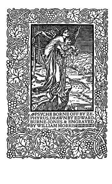
PSYCHE BORNE OFF BY ZEPHYRUS, DRAWN BY EDWARD BURNE-JONES & ENGRAVED BY WILLIAM MORRIS
began
printing books with the hope
of producing some
which would have a
definite
claim to beauty,
while at the
same time
they should be easy to
read and should not dazzle the eye, or trouble the intellect of the
reader by
eccentricity of form in the letters. I have always been a great admirer
of the
calligraphy of the Middle Ages, & of the earlier printing which
took its
place. As to the fifteenth-century books, I had noticed that they were
always
beautiful by force of the mere typography, even without the added
ornament,
with which many of them are so lavishly supplied. And it was the
essence of my
undertaking to produce books which it would be a pleasure to look upon
as
pieces of printing and arrangement
of type. Looking
at my adventure from this point of view then, I found I had to consider
chiefly
the following things: the paper, the form of the type, the relative
spacing of
the letters, the words, and the lines; and lastly the position of the
printed
matter on the page. It was a matter of course that I should consider it
necessary that the paper should be hand-made, both for the sake of
durability
and appearance. It would be a very false economy to stint in the
quality of the
paper as to price: so I had only to think about the kind of hand-made
paper. On
this head I came to two conclusions: 1st, that the paper must be wholly
of
linen (most hand-made papers are of cotton today), and must be quite
'hard,' i.
e., thoroughly well sized; and 2nd, that, though it must be 'laid' and
not
'wove' (i. e., made on a mould made of obvious wires), the lines caused
by the
wires of the mould must not be too strong, so as to give a ribbed
appearance. I
found that on these points I was at one with the practice of the
paper-makers
of the fifteenth century; so I took as my model a Bolognese paper of
about
1473. My friend Mr. Batchelor, of Little Chart, Kent, carried out my
views very
satisfactorily, and produced from the first the excellent paper, which
I still
use.
Next
as to type. By instinct rather than by conscious thinking it over,
I began by getting myself a fount of Roman type. And here what I wanted
was
letter pure in form; severe, without needless excrescences; solid,
without the
thickening and thinning of the line, which is the essential fault of
the
ordinary modern type, and which makes it difficult to read; and not
compressed
laterally, as all later type has grown to be owing to commercial
exigencies.
There was only one source from which to take examples of this perfected
Roman type,
to wit, the works of the great Venetian printers of the fifteenth
century, of
whom Nicholas Jenson produced the completest and most Roman characters
from
1470 to 1476. This type I studied with much care, getting it
photographed to a
big scale, and drawing it over many times before I began designing my
own
letter; so that though I think I mastered the essence of it, I did not
copy it
servilely; in fact, my Roman type, especially in the lower case, tends
rather
more to the Gothic than does Jenson's.
After
a while I felt that I must have a Gothic as well as a Roman fount;
and herein the task I set myself was to redeem the Gothic character
from the
charge of unreadableness which is commonly brought against it. And I
felt that
this charge could not be reasonably brought against the types of the
first two
decades of printing: that Schoeffer at Mainz, Mentelin at Strasburg,
and
Gunther Zainer at Augsburg, avoided the spiky ends and undue
compression which
lay some of the later type open to the above charge. Only the earlier
printers (naturally
following therein the practice of their predecessors the scribes) were
very
liberal of contractions, and used an excess of 'tied' letters, which,
by the
way, are very useful to the compositor. So I entirely eschewed
contractions,
except for the '&,' and had very few tied letters, in fact none
but the
absolutely necessary ones. Keeping my end steadily in view, I designed
a
black-letter type which I think I may claim to be as readable as a
Roman one,
and to say the truth I prefer it to the Roman. This type is of the size
called Great
Primer (the Roman type is of 'English' size); but later on I was driven
by the
necessities of the Chaucer (a double-columned book) to get a smaller
Gothic
type of Pica size.
The
punches for all these types, I may mention, were cut for me with
great intelligence and skill by Mr. E. P. Prince, and render my designs
most
satisfactorily.
Now as
to the spacing: First, the 'face' of the letter should be as
nearly conterminous with the 'body' as possible, so as to avoid undue
whites
between the letters. Next, the lateral spaces between the words should
be (a)
no more than is necessary to distinguish clearly the division into
words, and
(b) should be as nearly equal as possible. Modern printers, even the
best, pay
very little heed to these two essentials of seemly composition, and the
inferior ones run riot in licentious spacing, thereby producing, inter
alia,
those ugly rivers of lines running about the page which are such a
blemish to
decent printing. Third, the whites between the lines should not be
excessive;
the modern practice of 'leading' should be used as little as possible,
and
never without some definite reason, such as marking some special piece
of
printing. The only leading I have allowed myself is in some cases a
'thin' lead
between the lines of my Gothic pica type: in the Chaucer and the
double-columned books I have used a 'hair' lead, and not even this in
the 16mo
books. Lastly, but by no means least, comes the position of the printed
matter
on the page. This should always leave the inner margin the narrowest,
the top somewhat
wider, the outside (fore-edge) wider still, and the bottom widest of
all. This
rule is never departed from in mediæval books, written or printed.
Modern
printers systematically transgress against it; thus apparently
contradicting
the fact that the unit of a book is not one page, but a pair of pages.
A
friend, the librarian of one of our most important private libraries,
tells me
that after careful testing he has come to the conclusion that the
mediæval rule
was to make a difference of 20 per cent. from margin to margin. Now
these matters
of spacing and position are of the greatest importance in the
production of
beautiful books; if they are properly considered they will make a book
printed
in quite ordinary type at least decent and pleasant to the eye. The
disregard
of them will spoil the effect of the best designed type.
It was
only natural that I, a decorator by profession, should attempt to
ornament my books suitably: about this matter, I will only say that I
have
always tried to keep in mind the necessity for making my decoration a
part of
the page of type. I may add that in designing the magnificent and
inimitable
woodcuts which have adorned several of my books, and will above all
adorn the
Chaucer which is now drawing near completion, my friend Sir Edward
Burne-Jones
has never lost sight of this important point, so that his work will not
only
give us a series of most beautiful and imaginative pictures, but form
the most
harmonious decoration possible to the printed book.
Upper Mall, Hammersmith.
Nov. 11, 1895